Good to Go is a concept app designed to help students decide where to go out without wasting time standing in long lines.
The idea is simple:
Students can open the app to see real-time wait times and crowd levels at bars and restaurants around campus. Instead of committing to one spot and hoping for the best, they can make smarter, faster decisions based on what’s actually happening that night.
This fictional product allowed our team to practice building a campaign around a real behavioral problem—long lines and last-minute plan changes—while strengthening our skills in strategic planning, creative execution, and business acumen.

Working as part of a three-person strategy team, I contributed to the development of the campaign strategy behind the Good to Go concept. My role focused on audience research, insight development, and shaping the campaign’s messaging and positioning. Together, our team translated survey findings and behavioral insights into a cohesive campaign that earned recognition for Best Campaign Idea in a student competition.
Building on this strategy, we concepted the Good to Go app by mapping student going-out behavior to a clear, intuitive layout. The experience centered on an interactive map with color-coded crowd levels to help users quickly assess wait times and make real-time decisions. We also developed a rewards-based system that encouraged students to share updates in exchange for deals and perks, reinforcing engagement while creating value for local businesses. These elements formed a realistic product framework that supported the campaign strategy and demonstrated our ability to think through user experience, incentives, and business impact.

This visual outlines the foundation of the Good to Go concept by clearly defining the target audience, core features, and value proposition. Our team focused on communicating the idea quickly and intuitively—highlighting the interactive map, real-time crowd indicators, and push notifications—while grounding the concept in survey data about student behavior. This layout helped translate research insights into a clear, user-facing narrative that explained why the product mattered and how it would fit into students’ existing going-out routines.
This visual also served as a strategic alignment tool for our team, helping us ensure that each feature connected back to a specific audience insight or behavioral need. By organizing information around how students plan their nights out, we were able to prioritize clarity over complexity and keep the experience focused on decision-making in real time. The layout reinforced the campaign’s core idea by showing how research, features, and messaging worked together as one cohesive system rather than separate elements.
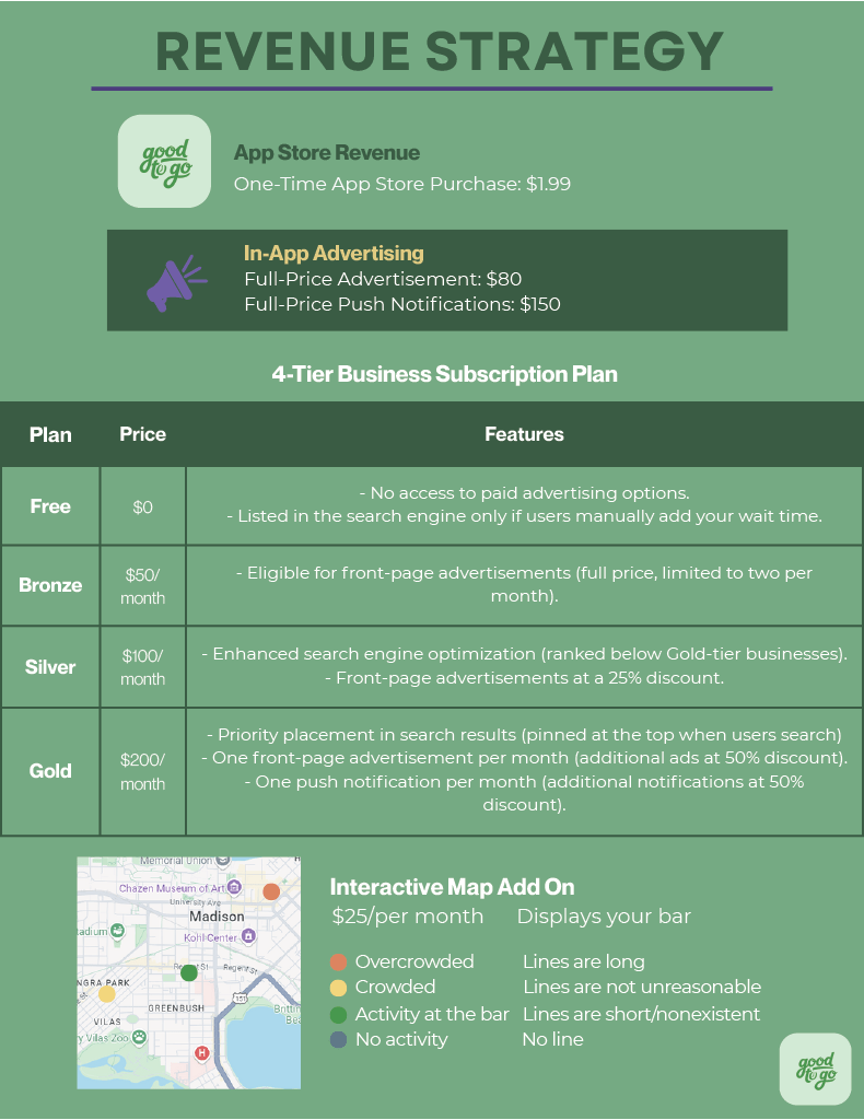
This visual expands the concept by detailing the revenue and business strategy behind the app. As a team, we developed a multi-tier subscription model for local businesses, in-app advertising options, and add-on features like enhanced map visibility and push notifications. The goal was to balance accessibility for students with sustainable value for businesses, demonstrating how the concept could function as both a user-centered product and a viable business model. This approach allowed us to apply strategic thinking beyond creative execution and consider long-term scalability and partnerships.
This framework also challenged our team to think critically about pricing, incentives, and value exchange from both the user and business perspectives. By outlining tiered offerings and paid placements, we were able to evaluate how different partners might engage with the platform at varying levels, while still maintaining a positive experience for students. This process strengthened our understanding of how campaign strategy, product design, and revenue planning intersect, reinforcing the importance of building concepts that are both creatively compelling and economically sustainable.
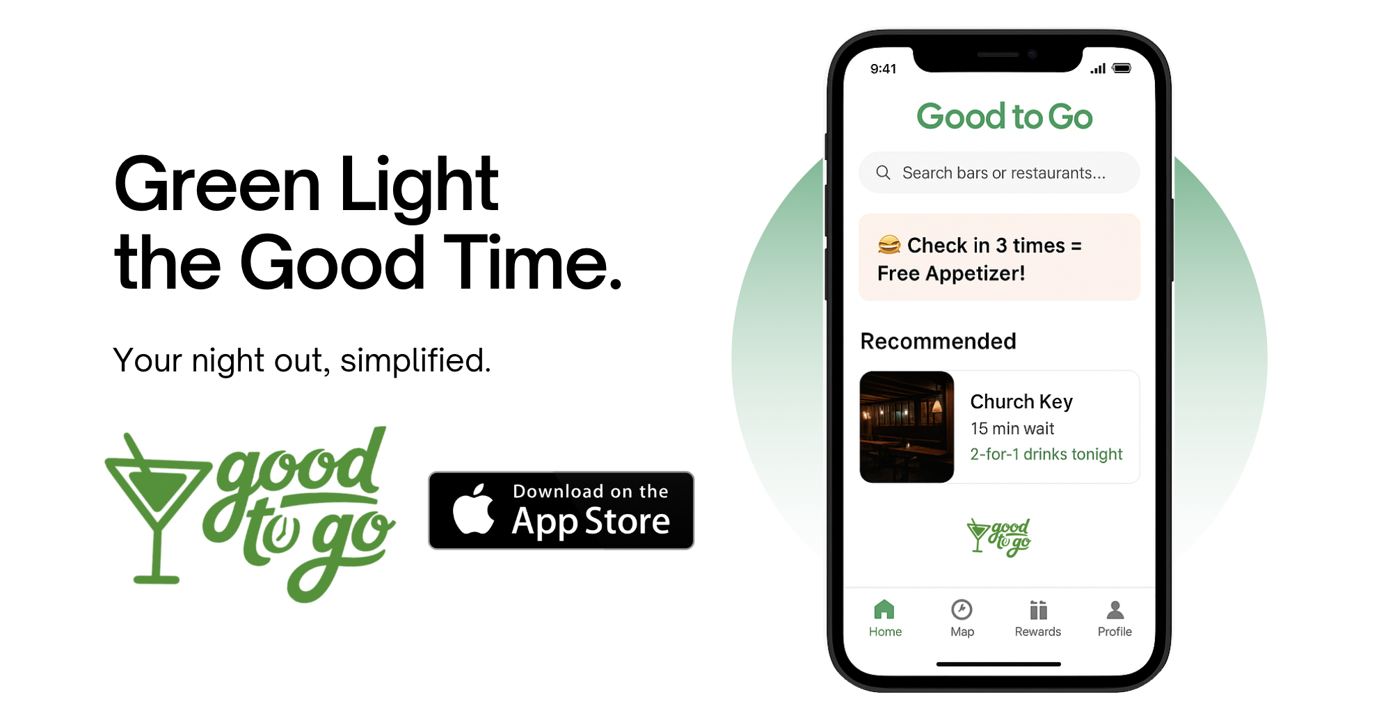

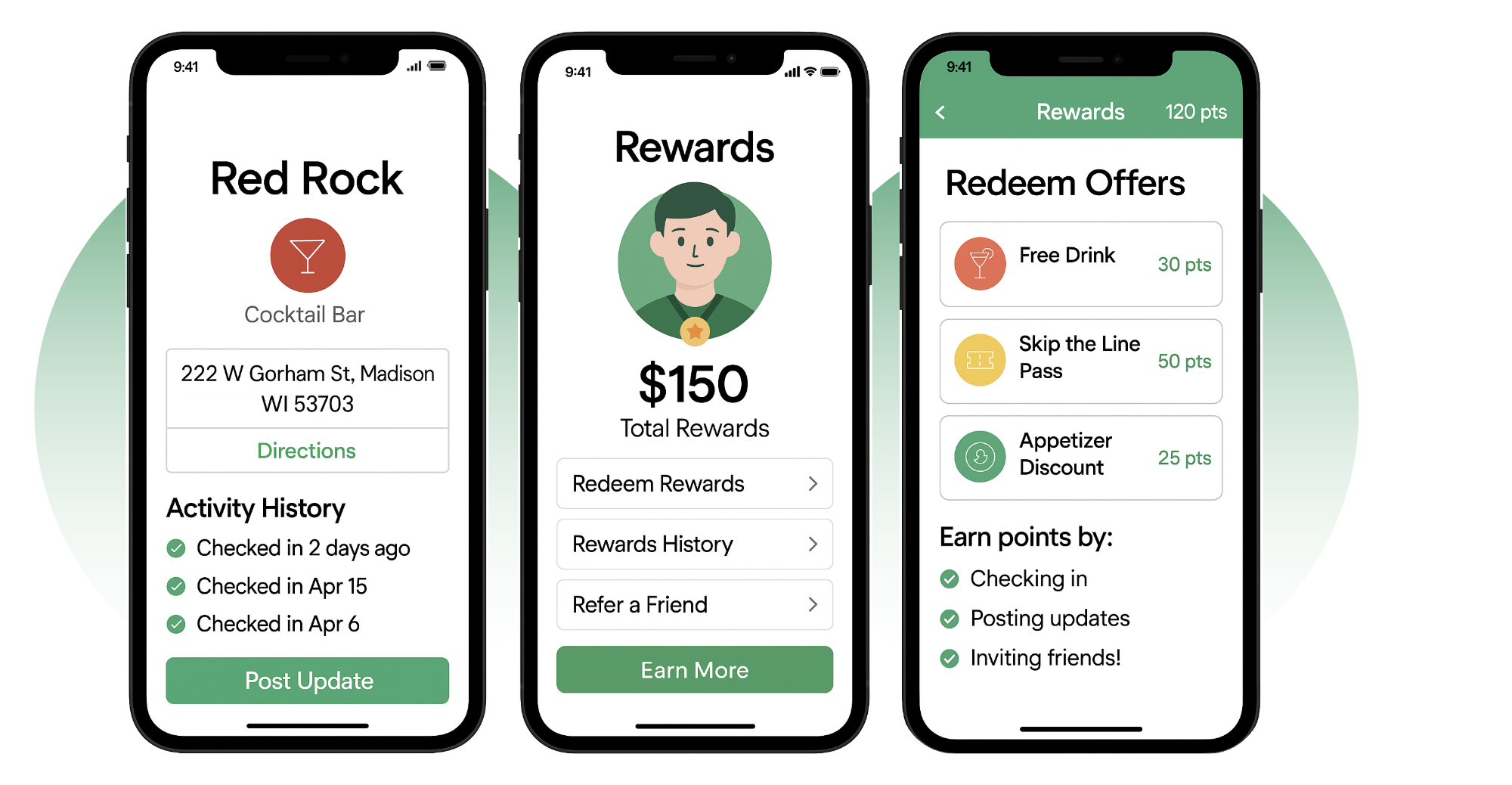

These images showcase what Good to Go could look like if it became a real app, with a simple and user-friendly interface that we designed together to ensure easy navigation. Our team worked hard to create bright visuals and a clear layout that highlight key features aimed at enhancing user experience, such as quick access to services and engaging elements that keep users interested. Through various scenarios we crafted, potential users can see how our combined efforts could make their lives easier and more organized, from planning tasks to managing daily routines with greater ease.
